Surface and society: an active exchange in urban environments
By Chris Panfil
December 11, 2020
Chris Panfil is Vice President and Director of Planning and Urban Design at WATG Singapore. Over the past two decades, one focus of his work has been to understand, improve and envisage our urban spaces – including the role that creative design solutions play in our history, culture and environment. Recently, he was invited to share his knowledge at the Annual Forum of The Architectural Society of Shanghai, China, speaking on the topic of “Sustainable development and resilient city construction: The relationship between architectural surface and city in the eyes of architects.” Here are the highlights of his presentation and his afterthoughts.
The most legible urban spaces ‘give back’ through design: they create an active exchange between exterior surfaces and the natural environment.
Resilient, sustainable cities are made up of many things, but the nature of their urban spaces plays a key role in fostering both these qualities. The most legible urban spaces ‘give back’ through the design of their building envelope: they create an active exchange between exterior surfaces and the natural environment, and offer engagement. In other words, the façade speaks to the city, and the city responds – whether that be via communication, an expression of cultural or historical relevance, a response to environmental challenges and opportunities, or some other form or function. As urban designers, facilitating this relationship is one of the core pillars of resilient design – ensuring long-term value for clients, city dwellers and visitors not only from an environmental standpoint, but from social, cultural and economic perspectives too. Below, I share some examples of the role vertical surfaces play in defining public spaces and their relationship to cities.
In an urban context, contemporary and informal painted façades contribute greatly to the cultural fabric of a city and reveal much about its personality and priorities.
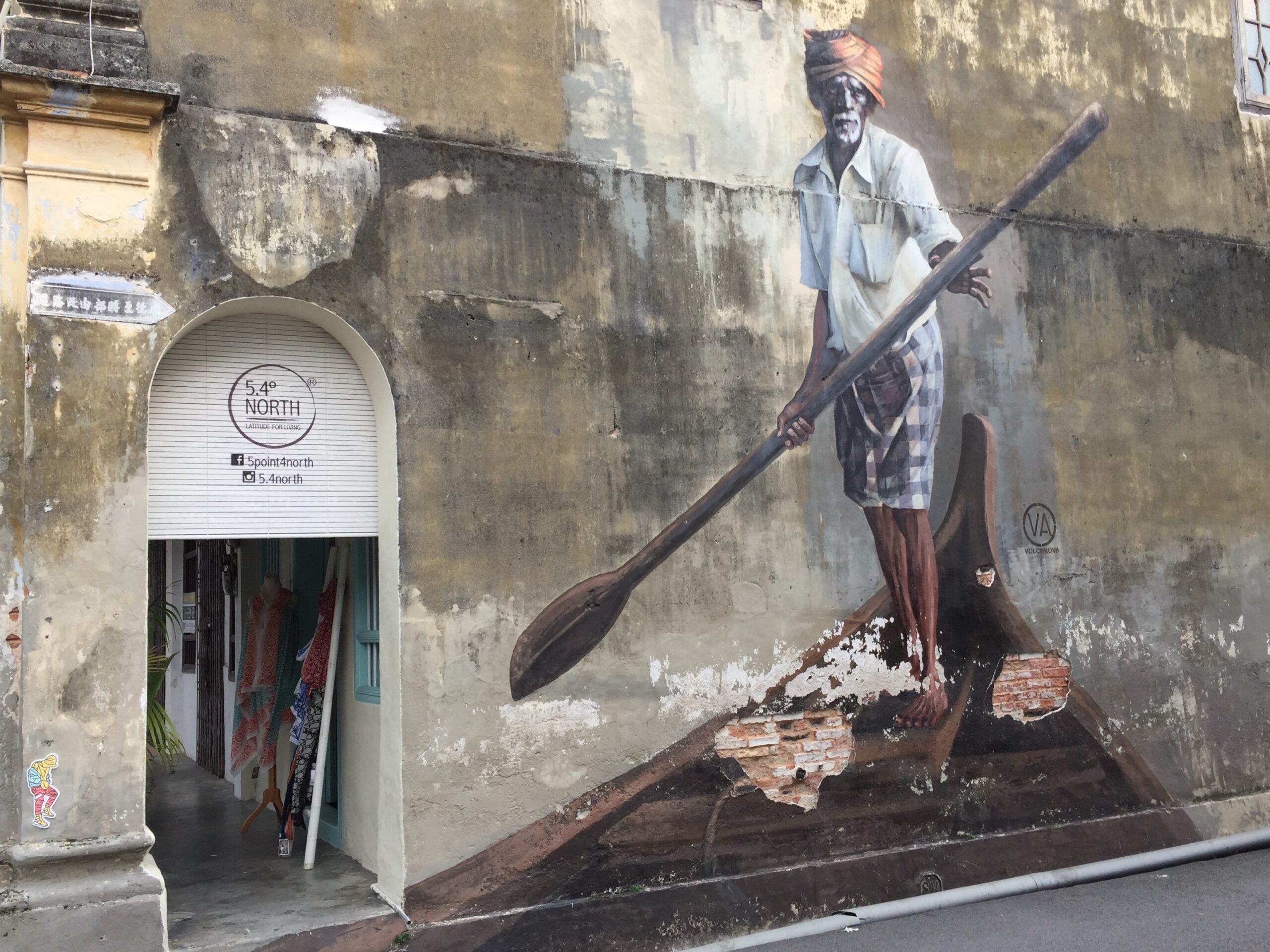
Street art in Penang, Malaysia
Arts, culture and semi-permanence
For centuries, painted façades have been used extensively throughout Europe and other parts of the world – either for decorative, communicative or, at times, functional purposes. A great tradition, this practice has evolved as a creative way of drawing attention to the power and significance of the built environment – often in a semi-permanent form. In an urban context, contemporary and informal interpretations such as graffiti and street art contribute greatly to the cultural fabric of a city and reveal much about its personality and priorities – so much so that many destinations have adopted this focus as part of their arts and tourism strategies. George Town in Penang, Malaysia, is a prime example: artworks adorn the walls of many traditional shophouses and buildings, drawing attention to the structures but at the same time denying the significance of the building in favor of what it is projecting.
How can a building symbolize its environmental context and contribute to improved microclimates in urban areas?

Street art in Penang, Malaysia, photographed by Yaopey Yong
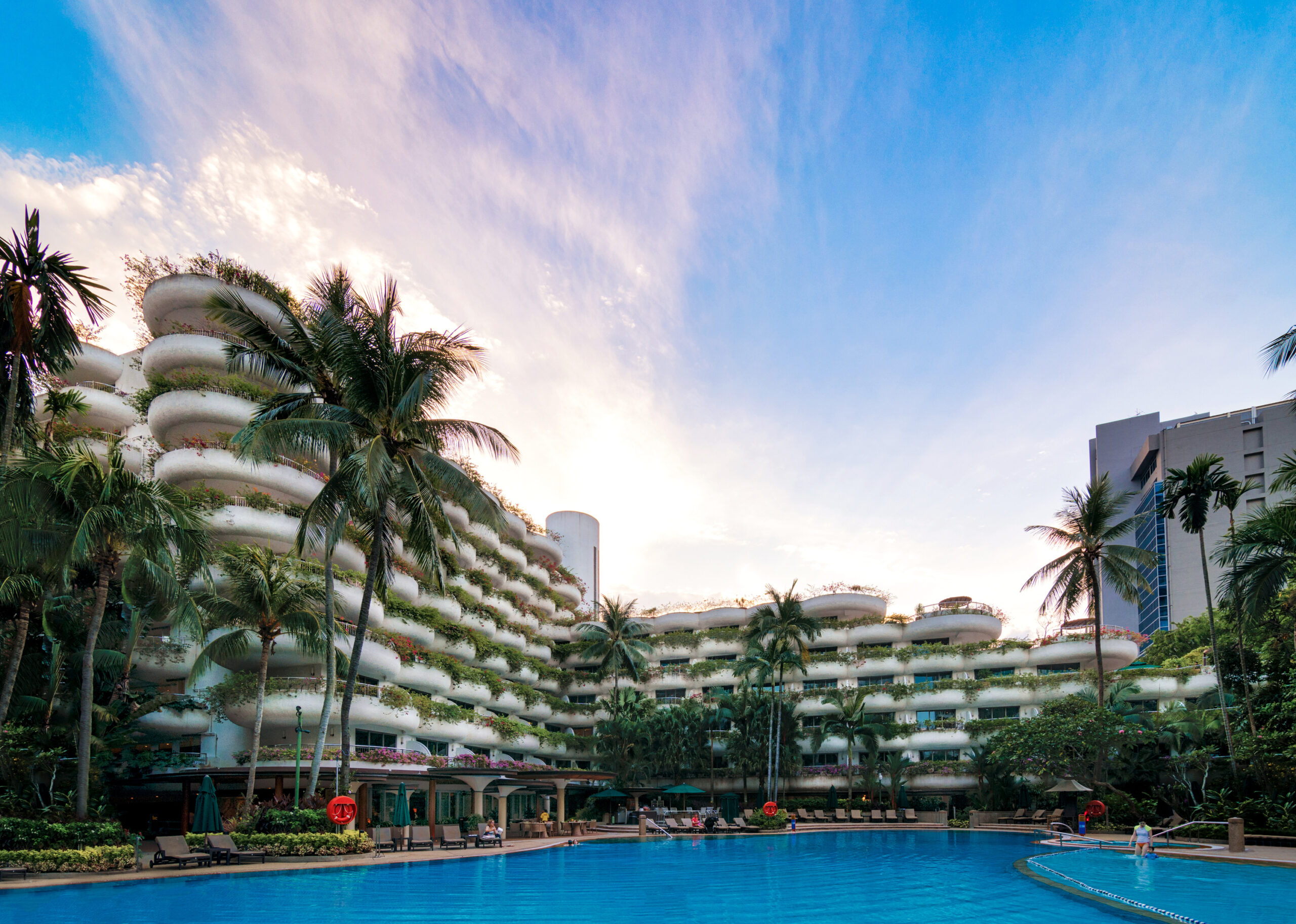
WATG’s Shangri-La Singapore Garden Wing, designed by Pete Wimberly and opened in 1978
Environmental building envelopes: urban greening
How can a building symbolize its environmental context and contribute to improved microclimates in urban areas? Our founder Pete Wimberly was a big proponent of tackling this issue. While green walls have become so ubiquitous that you could pick examples from almost any corner of the globe – Ho Chi Minh City, to Cyprus, to Copenhagen – Singapore, of course, does this particularly well. In some cases, buildings themselves disappear completely behind an elegant, private, green design that stands as a testament to the hope for a more efficient, renewable and environmentally prosperous future. As long ago as the mid-1970s, the Shangri-La Singapore Garden Wing was designed by WATG so that its façades feature deep curvilinear balconies with generous planting. These “hanging gardens” not only provide shade and improved thermal comfort to the guests, but they also create a beautiful interface between public and private space – celebrating the importance of plant life in the city. Nearby, the Oasia Hotel, designed by WOHA architects, takes this gesture to Singapore’s CBD, with a tower façade made entirely of a metal mesh system, which will – eventually – be completely overgrown with creepers. Here, large private “void decks” at various levels provide elevated lush green outdoor spaces in stunning contrast to the surrounding urban context of tall office buildings.
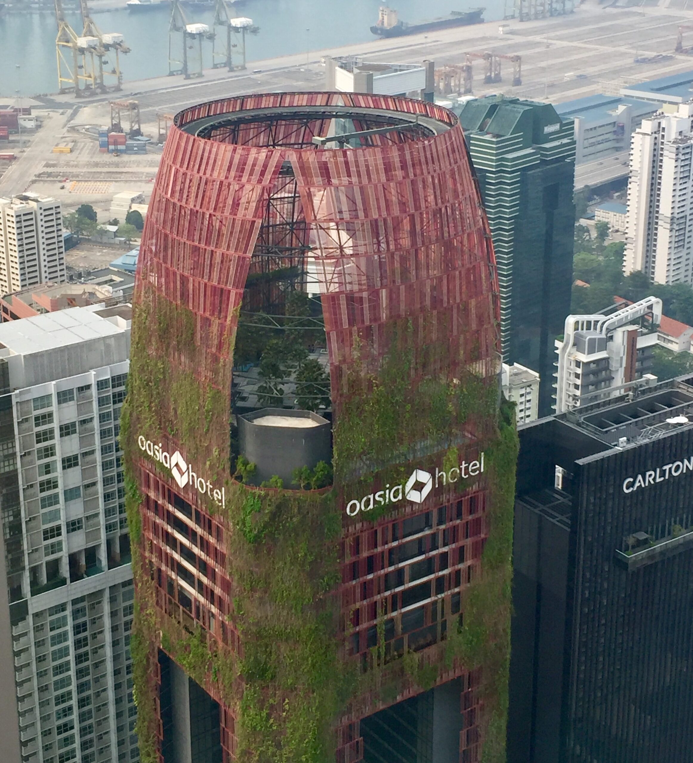
Singapore’s Oasia Hotel
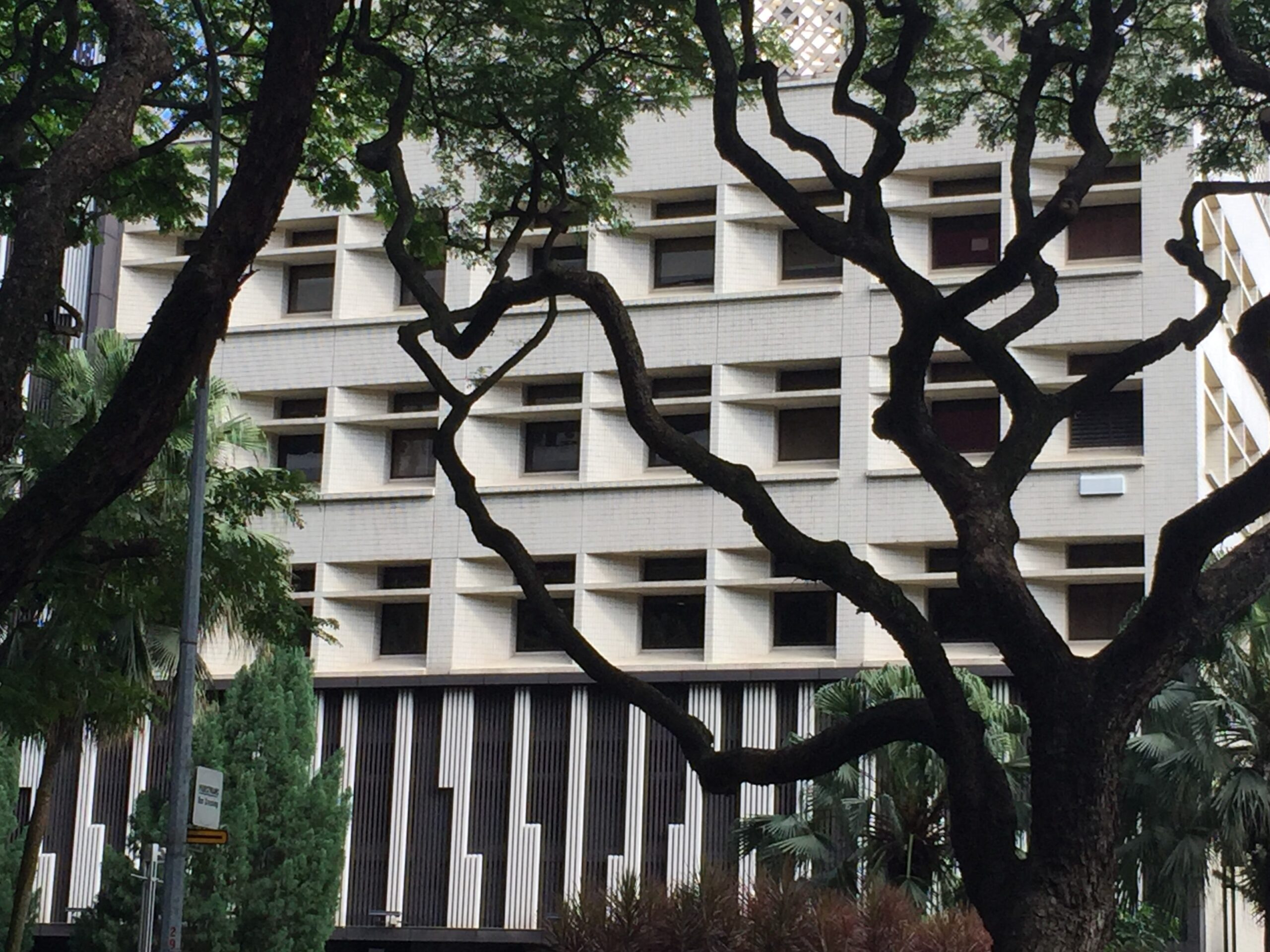
Old Bukit Merah URA, Singapore, with its deep-set windows to protect against the harsh climate
Public defining private
While less common, façade-first approaches quite literally define the prominence of a public, urban space first, with the private, functional aspects to follow. In Paris, the Place Vendome, constructed in 1720, is a remarkable example, where originally the entirety of the ‘back of house’ was erected after the front façade had been constructed as a free-standing wall in an effort to control the quality and uniformity of public space. Similarly, in the United Kingdom, Bath’s famous Royal Crescent, Circus and Square provide uniformity in façade design towards the street for the benefit of locals and visitors alike, while permitting far less regulated development at the back of the houses for private uses. More recently, Central Saint Giles in London utilized a similar technique – though in reverse: instead of using the front façade of the buildings to clearly define an external urban space beyond the building block, these colorful screens rather define the totality of the building ensemble against the rest of the city.
In 18th century Europe, a façade’s primary role was to define the public space in front of the building. Nowadays, most designs call attention to the building itself.
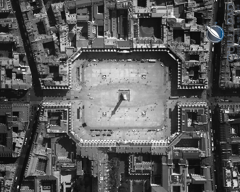
The Place Vendome in Paris
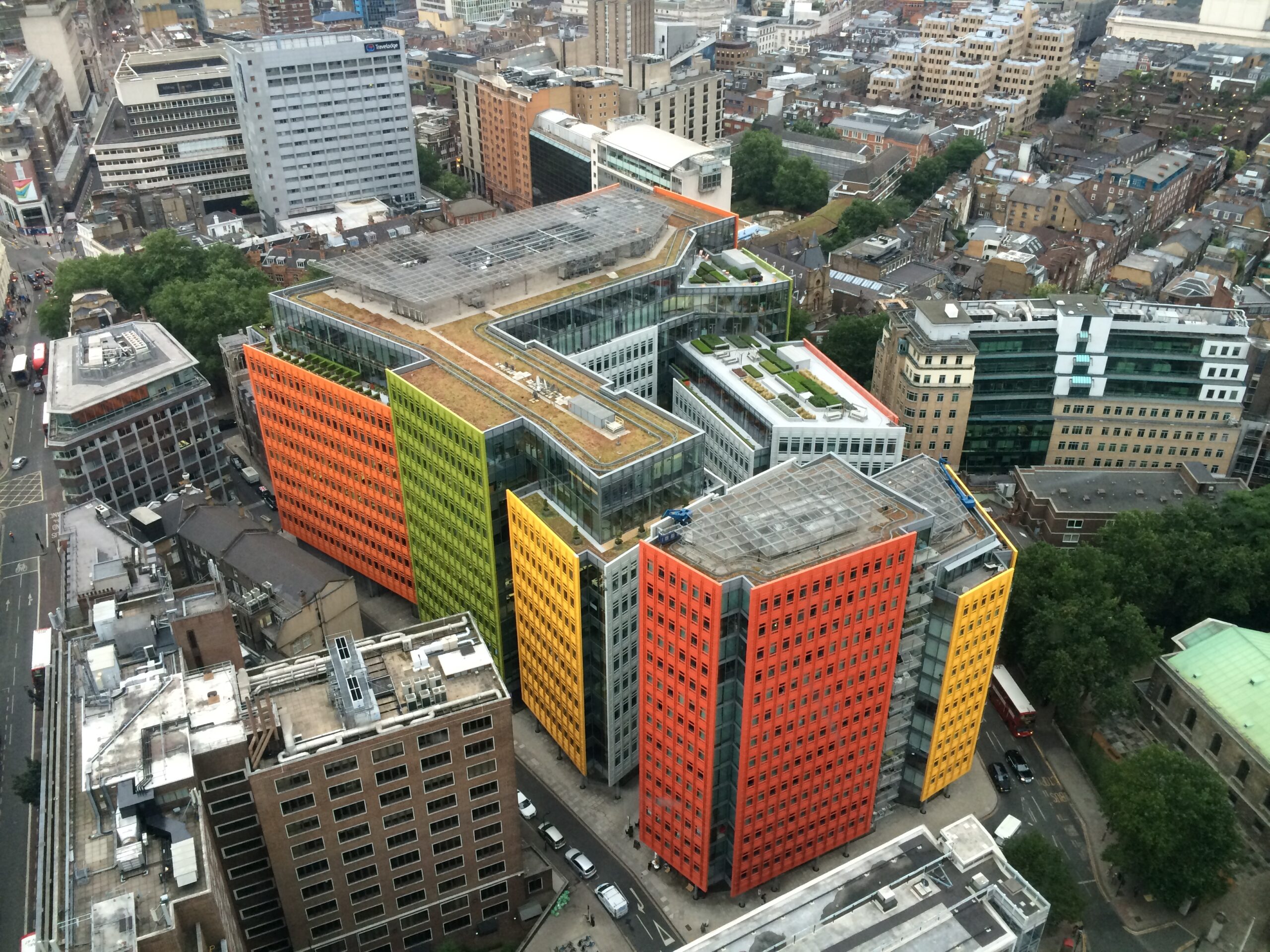
London’s Central Saint Giles by Renzo Piano
These examples, three centuries apart, demonstrate a complete turn-around in thinking about the function of a façade: in 18th century Europe, its primary role was to define the public space in front of the building. By the 21st century, most façade designs call attention to the building itself – to the constructed object. The former approach prioritizes the public by first defining the space – giving primacy to the experience of the community and visitors. In contrast, the latter approach prioritizes the private building through façade designs which further articulate the building itself.
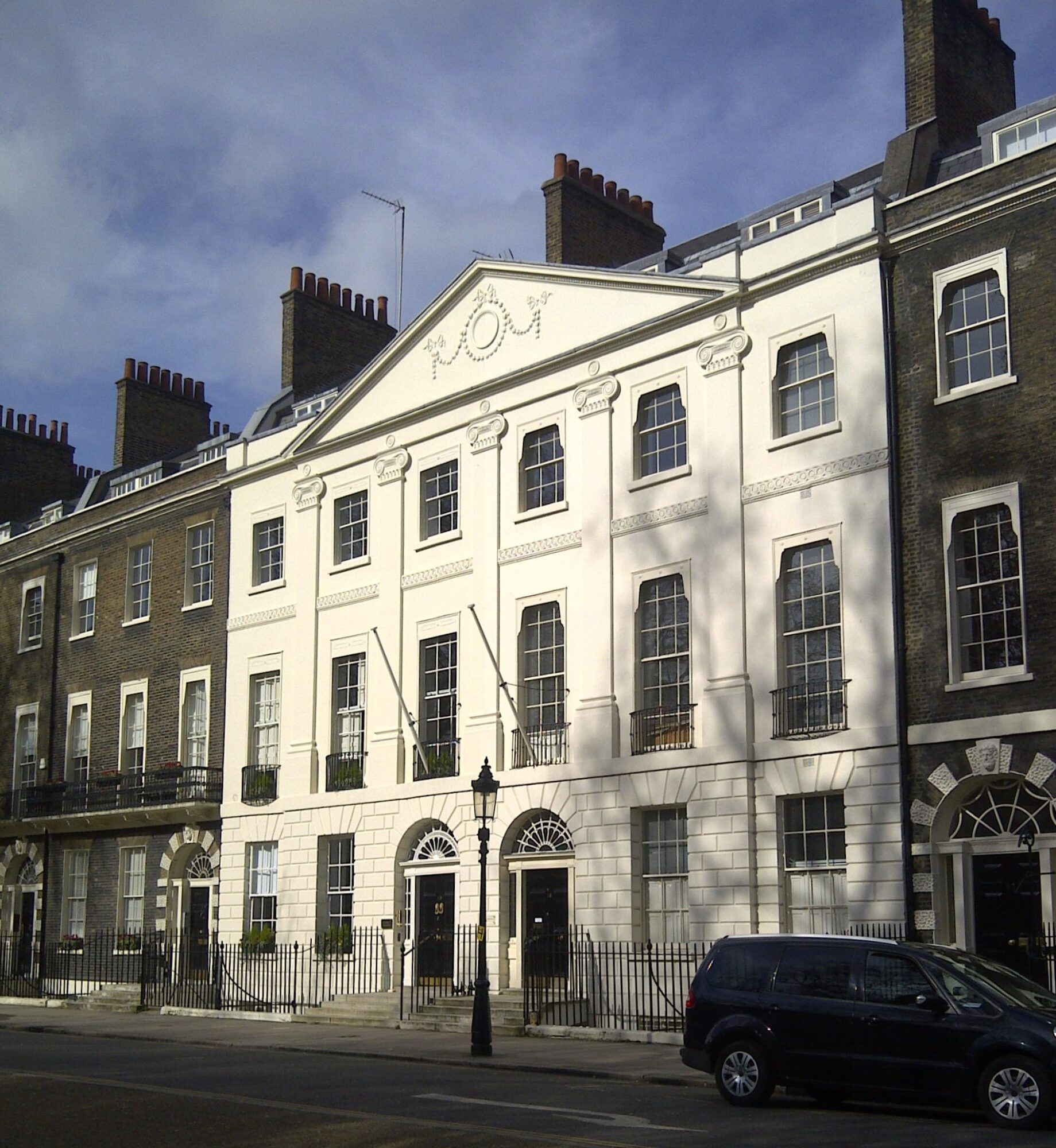
Bedford Square in London
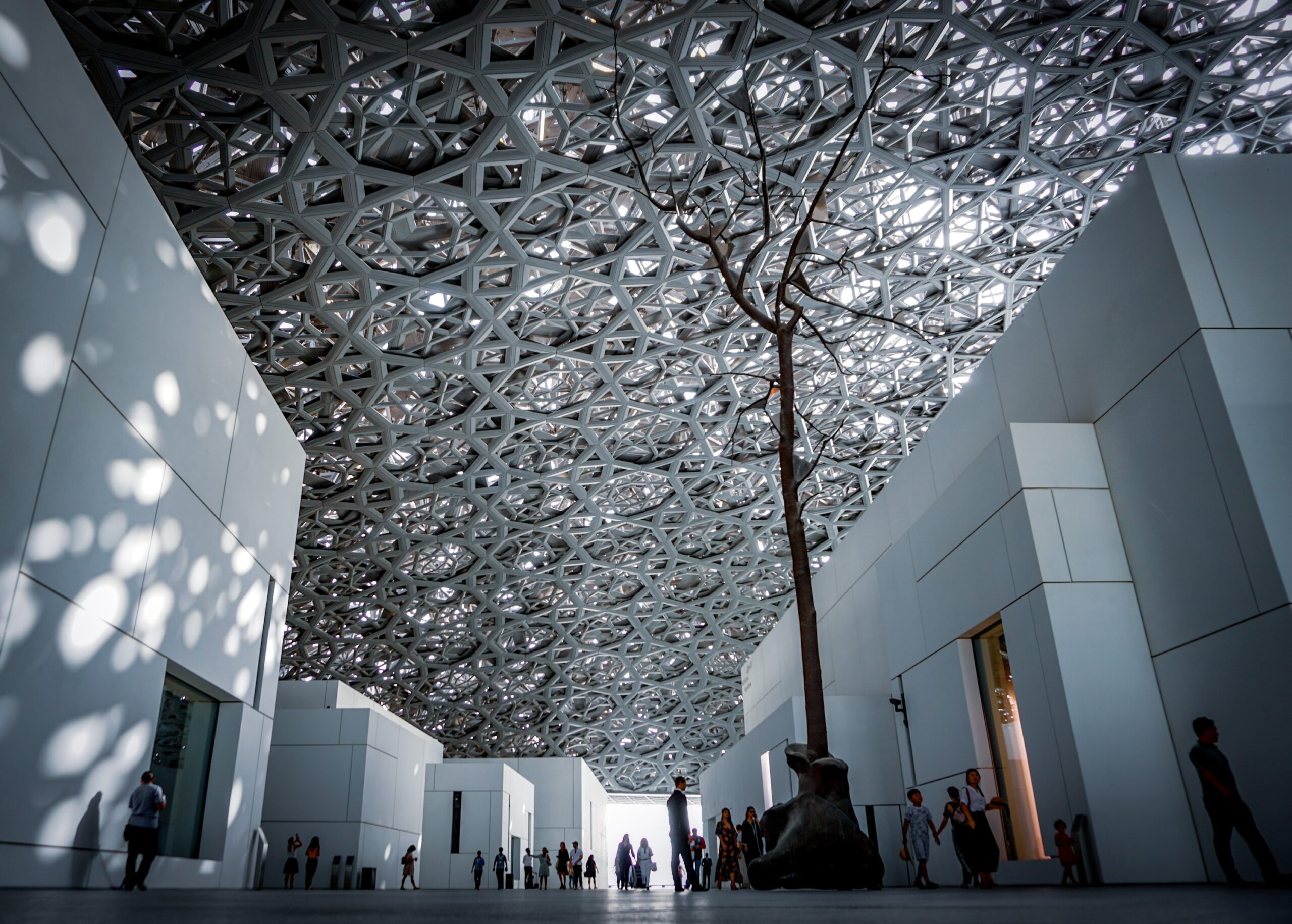
Jean Nouvel’s Louvre Abu Dhabi, photographed by Agnieszka Kowalczyk
Screen façades and their many manifestations
Screens, as part of the building envelope, communicate with cities in different ways – practical, cultural, commercial, environmental, and more. To me, French architect Jean Nouvel has some of the most interesting examples of this in practice. In Abu Dhabi, his shallow dome at the Louvre Museum is articulated as an extraordinary mesh that modulates the strong light and hot sun of the desert climate, while also making cultural references to privacy screens in traditional settings of public and private buildings. In Paris in the 1980s, Nouvel used technology to solve a similar environmental challenge – designing a façade for the “l’Institut du monde Arabe” that is made up of small, mechanical facets that regulate the amount of light that enters the building and thereby responds to external environmental conditions. In a true exchange between public and private, the façade of the building doubles as a communication device: it is a screen which projects images about the exhibitions and other announcements about events at the institute.
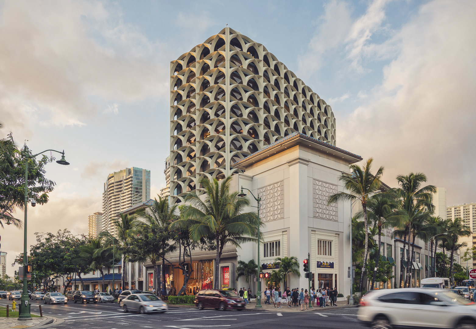
Waikiki Galleria Tower, formerly the Royal Bank of Hawaii, designed by Pete Wimberly
Decorative screens play a significant role in our urban spaces, but sometimes in less obvious yet still very functional ways: environmental, communicative, cultural, and more.
Decorative screens play a significant role in our urban spaces, too, but sometimes in less obvious yet still very functional ways. Take for example our founder Pete Wimberly’s former Bank of Hawaii building (now Galleria Tower Waikiki), which features interlacing arches to provide lateral bracing and shading for the building’s windows, subsequently reducing the amount of air-conditioning required and eliminating the need for view-obstructing curtains. His former private residence in Manoa Valley offers a similar experience, with a grid of windows and sliding glass to manage the tropical climate, and provide decorative detailing at the same time.
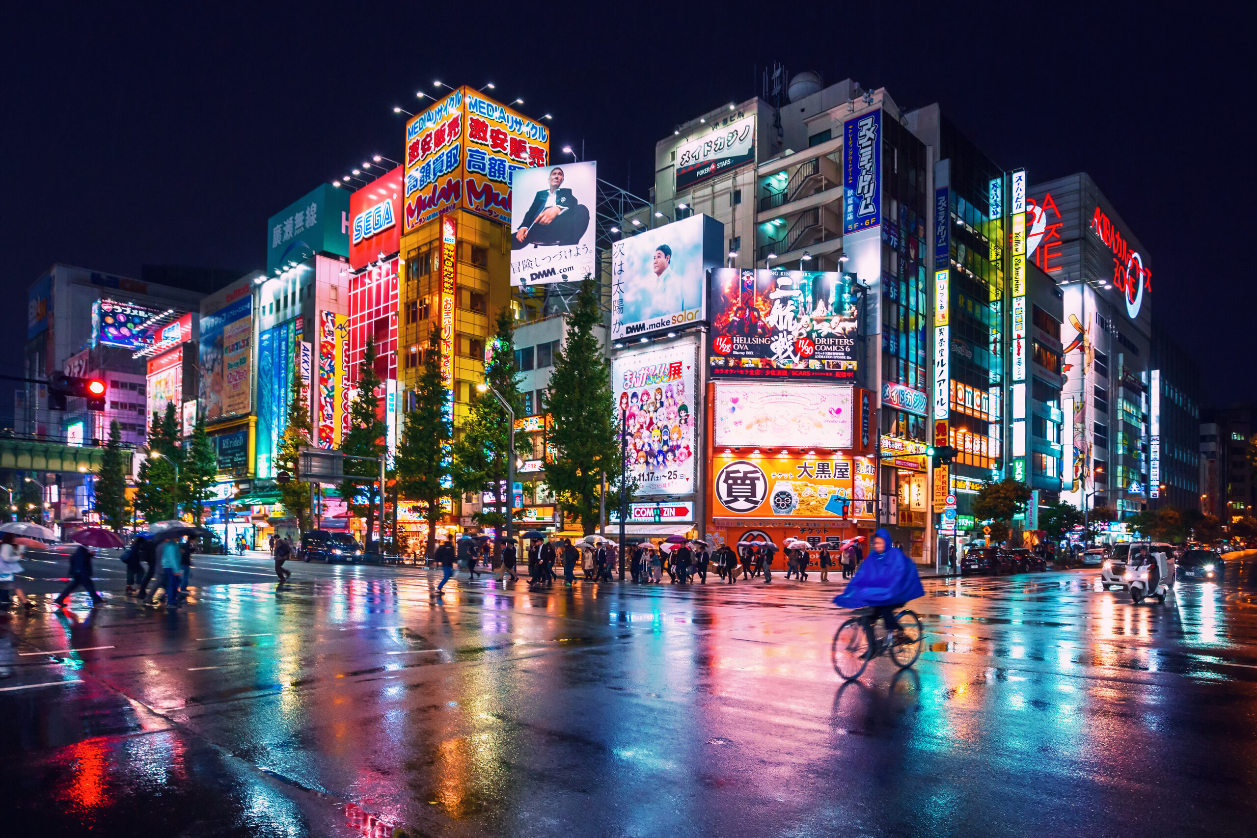
And how could we discuss screens without making mention to the digital world… No place in the world does it quite like Tokyo, especially as night falls. The use of digital screens is so pervasive in some Tokyo streets that the architecture of the buildings themselves becomes secondary, often barely visible. The temporal nature of the digital screen content creates special opportunities: in many Asian cities, for example, high-rises are used to communicate messages of joy for special holidays, such as Chinese New Year – either in abstract forms or as direct greetings from commercial businesses.
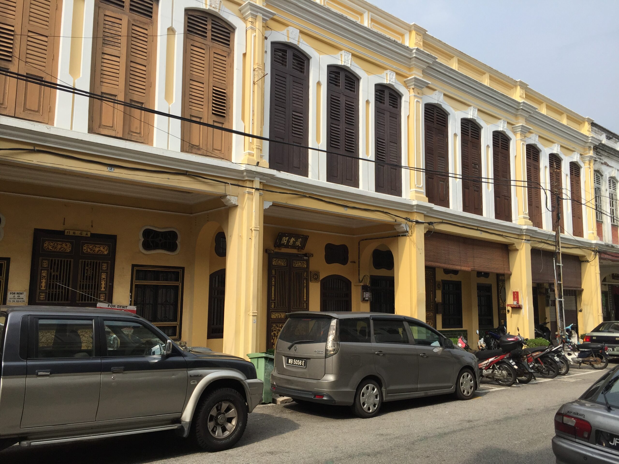
An example of the “Five Foot Way”
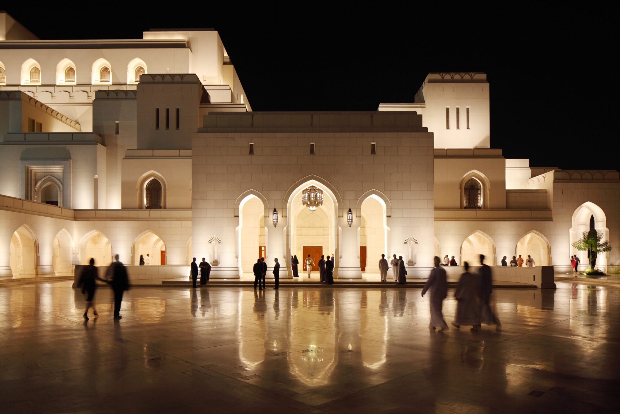
The Royal Opera House in Muscat, Oman
“Inhabitable façades”
For urban planners, what I call “inhabitable façades” offer some of the most exciting and innovative ways in which architecture and urban design can collaborate and reinforce one another. In Bologna, 40 kilometers of pedestrian arcades connect the entire historic core of the city from building to building – ensuring that no individual structure exists in isolation and that each contributes to the covered network of the city’s public realm. In parts of Southeast Asia, the “Five-Foot-Way” – a British colonial urban design rule – created cities with similar public realm networks. Retail and other commercial spaces spill out into these public arcades, while also playing a functional role as a protective way of circulating in cities with climates subject to intense rain and heat. A similar, connective approach was taken at the Royal Opera House in Muscat, Oman, designed by WATG with the Royal Court of Affairs. Arcades are used as a way of not only designating entrances, but to join the ancillary spaces such as retail and food and beverage areas, creating an urban quarter, rather than a series of individual buildings.
For urban planners, “inhabitable façades” offer some of the most exciting and innovative ways in which architecture and urban design can collaborate and reinforce one another.
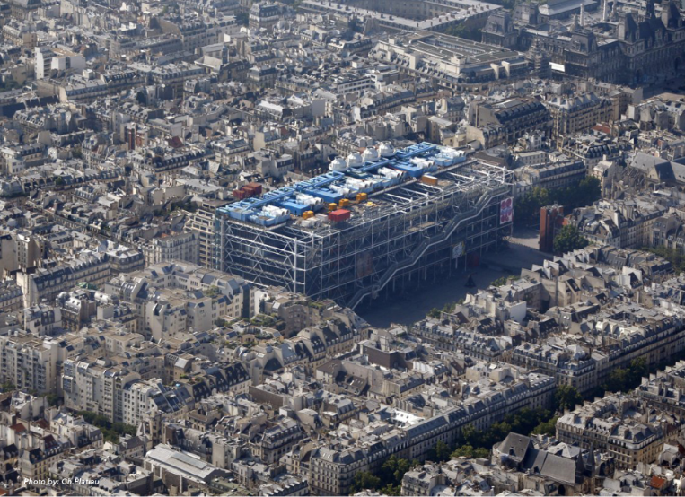
Paris’s Centre Pompidou by Richard Rogers and Renzo Piano
The most creative use of “inhabitable façades” extends into many other facets of the public realm. In Paris, once again, private space and public realm merge at the Centre Pompidou, where the façade is articulated as a space that incorporates the building’s vertical circulation systems – creating more room for interior galleries. Ingeniously, this circulation space also provides public access to a viewing platform at the top of the building via a series of escalators. Initially at least, access to this was not limited to gallery visitors: instead, the occupiable building façade invited the general public to view the historic centre of Paris from the gallery’s viewing platform. The building gives back to the city, ensuring that visitors not intending to view the art at the Centre Pompidou could still experience and benefit from the gallery’s presence.
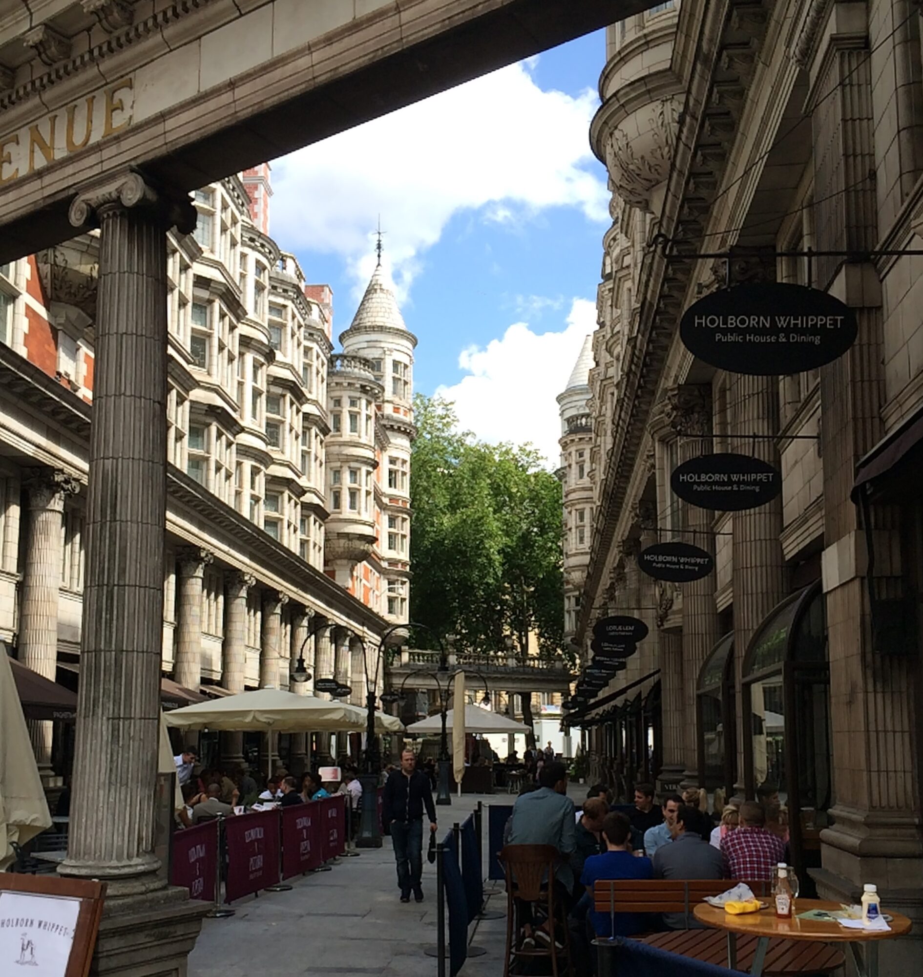
London’s Sicilian Avenue
Latest Insights
Perspectives, trends, news.
- Sustainability
Harnessing the Power of Wetlands in Sustainable Hospitality

- Sustainability
Harnessing the Power of Wetlands in Sustainable Hospitality

- News
80 years of WATG
- News
80 years of WATG

- News
A Journey Through Time – WATG80
- News
A Journey Through Time – WATG80
- Legacy
Tropical Modernism: Where It All Began

- Legacy
